Simple tips to make your written content more accessible.
Following this advice will also help you achieve compliance with accessibility guidelines such as WCAG (2.1).
Create logical, unique page titles
The page title will usually be the main page heading AND the last part of the URL. It’s also often the same titles that people will see in the navigation menu.
Keep it simple
This is the basic, fundamental information that people will use to navigate your website with ease. You want your whole website to be accessible after all don’t you? A frustrating mistake we often see is when a brand has tried to be clever about page titles. For example, a page that should be called ‘Company Values’ wouldn’t mean much to people if it was titled ‘Vibes & Stuff’. Don’t compromise user experience for brand differentiation. Call a page a page.
Differentiate the pages by title
You must make sure each page on your website has a title that distinguishes it from other pages. For example, if a page is part of a series of instructions that uses multiple pages – include the current step in the title.
If you want to include a company name on each page, put that after the unique page name. See the examples below.
Home page title
Huxley Digital
Page name followed by company name
Company Values – Huxley Digital
Page name including a step in process
How to audit your website (step 1 of 3) – Huxley Digital
Include meaningful headings and sub-headings, to improve user experience
Good, short headings and subheadings are incredibly useful for people who are seeking relevant content.
Not only does it let people know what the below text is about, it provides the reader with a way to save time by cutting out relevant sections, or quickly finding the part they need to access.
Avoid ‘intimidating’ blocks of text
One very interesting piece of feedback we receive when conducting user testing with an people with additional accessibility needs is that blocks of text with no formatting, or a lack of headings and subheadings are ‘intimidating’.
In some cases, copy that can not be scanned over easily will simply not be read at all.
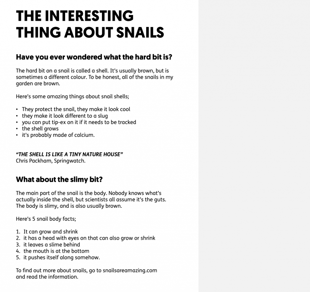
Here’s an example of how two short, simple headings can make it much quicker for a reader to scan down some text and find out what it’s about.
No sub-headings:
Huxley are accessibility specialists from Sussex
Huxley is a small team of digital specialists who focus on making accessible digital products. They are based in Shoreham-by-sea, Sussex.
In the office, the team enjoy a collaborative and informal culture. For their 2021 Christmas party, the team worked together to solve an escape room, and then went for a meal and drinks in a local restaurant.
The team size has doubled in the past 2 years to eight people. There are three developers, one designer, one project manager, one marketing specialist, one accessibility lead, and the founder and Managing Director Dom Huxley.
With sub-headings:
Huxley are accessibility specialists from Sussex
Huxley is a small team of digital specialists who focus on making accessible digital products. They are based in Shoreham-by-sea, Sussex.
Office Culture
In the office, the team enjoy a collaborative and informal culture. For their 2021 Christmas party, the team worked together to solve an escape room, and then went for a meal and drinks in a local restaurant.
The Team
The team size has doubled in the past 2 years to eight people. There are three developers, one designer, one project manager, one marketing specialist, one accessibility lead, and the founder and Managing Director Dom Huxley.
Heading Levels – what they are and why they’re used
Each heading on a page should be given a HTML ‘tag’ – ranging from H1 all the way down to H10. Other copy is ‘paragraph’ text.
In content management systems such as WordPress, you can select these tags in the text formatting panel, and it will add the tag to the code for you, as well as change other font elements for you – such as size, to reflect the heading hierarchy.
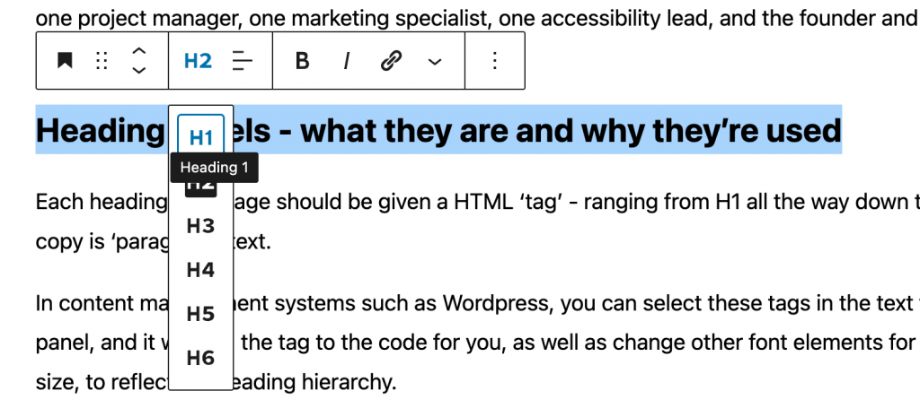
Heading levels give the page a structure. Someone who uses a keyboard to navigate a website can easily skip through the headings to get an overview, or find a relevant section.
Use link text that is relevant to the link destination
Far too many times we see ‘click here’ as link text. To someone with visual accessibility needs who uses a link list as a shortcut to find relevant content, this is how that list looks when the same link description is used used multiple times on one page;
Click here
Click here
Click here
Click here
Click here
Click here
Click here
Links should contain relevant information about the link destination. Example,
Read more about writing for accessibility
Using this simple rule, that same user with visual accessibility needs would scroll down a link list and hear a much more sensible series of links;
Writing for accessibility
Using H tags
Headings and sub headings
Contact Huxley
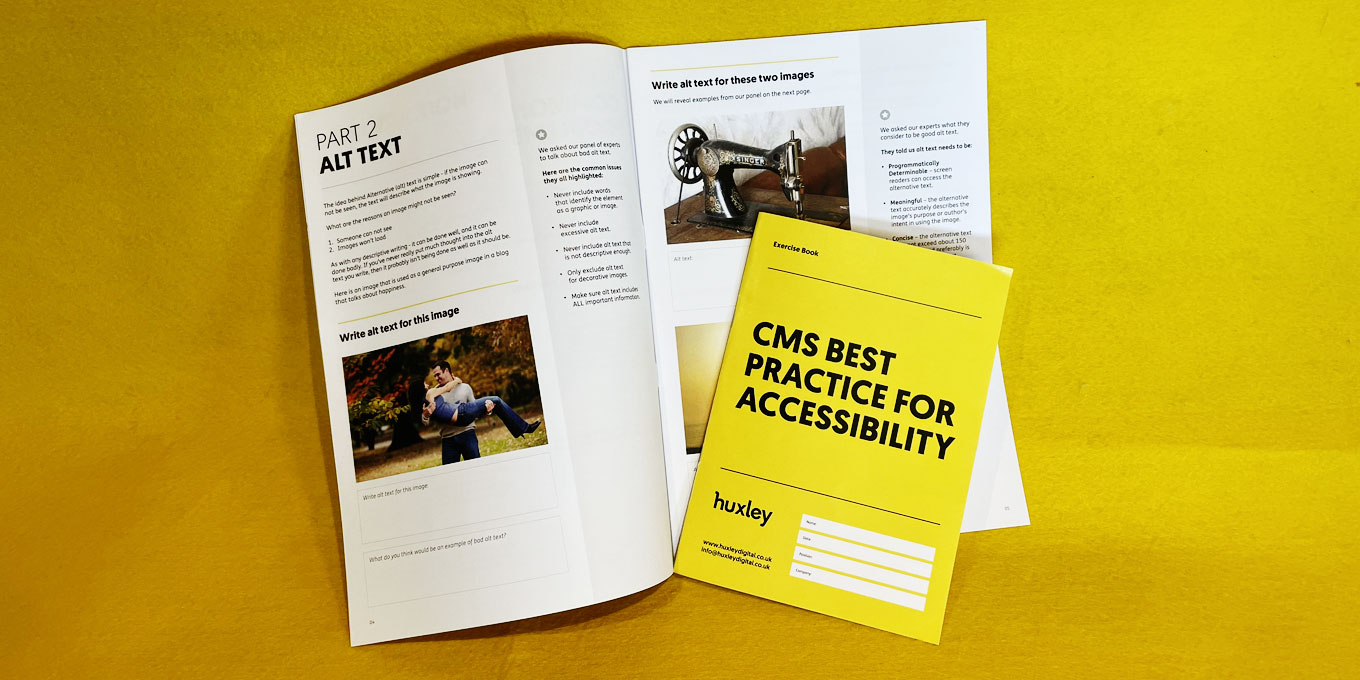
Write ‘alternative text’ for images that is functional
If someone can not see an image because of a visual impairment, or because of a technical issue, the ‘alternative text’ will show in its place.
People who manage content on websites will often include alternative text just because the CMS requests it, but like everything – there is a good and a bad way to go about it.
The idea behind Alternative (alt) text is simple – if the image can not be seen, the text will describe what the image is showing.
What are the reasons an image might not be seen?
- Someone can not see
- Images won’t load
As with any descriptive writing – it can be done well, and it can be done badly. If you’ve never really put much thought into the alt text you write, then it probably isn’t being done as well as it should be.
What to avoid when writing Alt text
- Never include words that identify the element as a graphic or image.
- Never include excessive alt text.
- Never include alt text that is not descriptive enough.
- Only exclude alt text for decorative images.
- Make sure alt text includes ALL important information.
Transcribe audio content, and caption multimedia content
Audio only content
We love podcasts, but to be accessible they need to be transcribed.
Think about the entire audio experience when you transcribe a conversation. There are sometimes non-lexical components of speech that provide meaning, such as pitch and speed of speaking, hesitation noises etc. These features are called ‘paralanguage’. Paralanguage that carries meaning needs to be included in the transcript. Eg “Melinda laughs”.
Multimedia content
For audio and visual content, such as a video interview, provide a transcript and captions. In the transcription for multimedia content, you must provide descriptions of important visual content, such as “Melinda walks away”.
Include instructions that are very easy to understand
If you need to provide an instruction or error message, you must make sure it is incredibly clear, simple and that it does not contain unnecessary jargon or information.
For example, if the user needs to create a password, state what information the user needs to provide;
Password should be 8 characters long, and include at least one number (0 – 9)
Make sure your written content is neat, clear and to the point
We have found that people who are often too connected to a product or cause find it hard to keep written content concise. Eg the founder of a start up might find it difficult to describe their product in one sentence.
But the problem exists wider, and some simple rules can improve the accessibility of anyone’s written content;
- Keep sentences and paragraphs short
- Use headings and subheadings to break text up
- Avoid jargon – if you’re unsure if something is or is not jargon, ask someone disconnected to the topic to read it for you
- If jargon is unavoidable, use a glossary
- If using an acronym, state what it stands for when it’s first used
- Use formatting where appropriate – eg, bullet point a list
- Use images, videos, illustrations to support the text and add meaning