Accessibility means more than putting things online. It means making your content and design clear and simple enough so that most people can use it without needing to adapt it, while supporting those who do need to adapt things.
If you’re familiar with Huxley, you probably know that we are passionate about accessibility – we want the internet to be fully inclusive to all people, including those living with physical impairments, cognitive disabilities, and environmental or technological barriers. While accessibility awareness has become more well-known in the past few years, with the international Web Content Accessibility Guidelines (WCAG 2.1) recognized as a global standard and requirement for the public sector, social media is still catching up to the rest of the digital world.
Making your brand accessible doesn’t just stop at your website; it also extends to your social media accounts. These tips will help you to have a more inclusive, user-friendly presence.
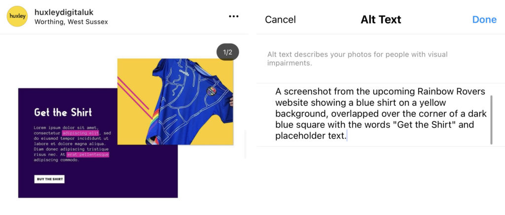
1. The first tip, and arguably most well-known, is to use alt text on every image, every time. Always. Alt text is a short description about what you can see in the image.
This is so important for those with severe visual impairments that rely on screen readers, and without it, it makes social media much harder to navigate.
Have trouble remembering? Write it on a post-it note, tie a piece of string around your finger, or try a browser extension like this one for Chrome.
How to submit alt text:
– For Facebook, upload the photo to your post, click Edit, then Alternative text
– For Instagram, upload your image and before you click Share, go down to Advanced Settings, then Write Alt Text
– For Twitter, upload the photo to your post, click Edit, then Alt.
2. Next, add an image description to the caption of your post.
This is different than alt text in that alt text generally has a character limit, so it’s vague and brief, while the image description can contain much more visual detail about the image.
For example, a photo of street art with people walking around might have the alt text of “A busy street with spray-painted graffiti”, while an image description might say, “Six people walking down a sunny urban street with a colourful spray-painted graffiti tag in the background and an ad for a lost cat hanging on the left side”. This can easily be put in brackets at the bottom of your caption on Instagram or Facebook.

3. Add closed captions or transcriptions to videos. Make sure to transcribe both dialogue, actions, and music.
This can also be helpful for people who browse without their sound on.
While Instagram doesn’t allow alt text for moving images, you can still add subtitles to the video itself, and the transcription to the caption.
4. Speaking of video, make sure to avoid using videos or gifs with too many flashing colours or lights, as this can be triggering to those who experience seizures or those with sensory issues.
Ultimately, nothing should flash more than 3 times a second.
5. Also be mindful with image and text transitioning to ensure the audience can follow along with the content. The average person reads 200-250 words per minute but be aware of those that may need more time to comprehend.
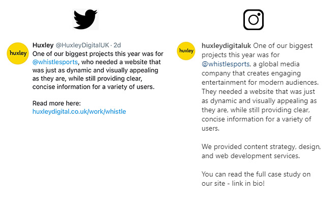
6. When posting across platforms, make sure you’re adapting it for the platform.
Instagram is better for long-form text with no links, while Facebook is better for long-form text with one or two links, and Twitter is better for short-form text with one link and a few hashtags.
Don’t just copy and paste the same exact post in all platforms, or a post with a link in Instagram will not show a clickable link (speaking of which, use something like Linktree if you need to use links on IG), a long Twitter post will be spread out over multiple tweets, etc.
7. Capitalise the words in your hashtags, also called CamelCase.
#whoreads or #WhoReads… Which one is more readable? Don’t leave it up for interpretation.
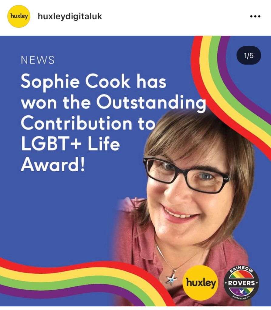
8. With stories or images with text, make sure to use a large, clear font without too much text.
If the background is busy, try adding a solid block colour behind the text to give it a highlighted effect.
Make sure to put the text in the caption, as well.
9. Avoid large sections of text and using complicated jargon – get straight to the point.
Social media posts are most effective when they’re brief, and you can’t expect your viewer to spend more than a few seconds on any one post. Use a Readability Test Tool if you need help.
10. Use line breaks in your captions to separate different sections of text. As social media text is so small to begin with, it makes it easier for everyone if it’s in more sizable chunks.
Also make sure to put hashtags on their own lines, down at the end of the post.
11. Limit emojis to two or three per post and avoid repeating them after each other.
They can confuse those with screen readers if they’re seemingly unrelated to the post (🍆 eggplant emoji, I’m looking at you), plus just seem spammy when used in excess.
Info from
https://later.com/blog/accessible-instagram-account/
https://veroniiiica.com/2020/05/27/how-to-make-instagram-stories-accessible-for-low-vision-users/
https://gcs.civilservice.gov.uk/guidance/digital-communication/planning-creating-and-publishing-accessible-social-media-campaigns/