Probably the number one most overlooked aspect of a website is its accessibility. Yes the text to you is easy to read, the colours look great and all the images are high res, but what about those customers of yours who have disabilities. Maybe they are blind? Or perhaps maybe they are just colour blind?
Accessibility web design is something that all business owners just can’t look past anymore. It is simply unacceptable to have a website that not everyone can use. So to help anyone who is looking to update their website to make it accessible we have 18 ways you can turn your inaccessible website into one that everyone can use.
1. Use high-contrast colour combinations
This is mostly talking about value rather than hue, though we’ll get into hue in a later tip.
The W3C requires a contrast ratio between text and its background of at least 4.5 to 1, which can be checked with WebAIM’s contrast checker.
According to the World Health Organisation, blindness and vision impairment affect at least 2.2 billion people around the world.

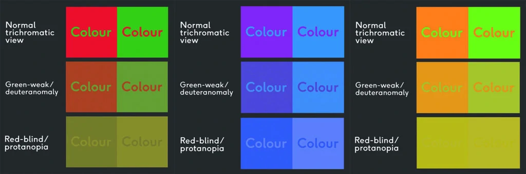
2. Avoid clashing colour combinations
Maintaining a high hue contrast can be just as important as value contrast. Combinations like red + green, purple + blue, or orange + green can be difficult to differentiate between for people with colour blindness, or those with uncalibrated computer or mobile screens.
According to Colour Blind Awareness, approximately 1 in every 12 men (and 1 in every 200 women) are colour blind, making up 4.5% of the British population. Though people with colour blindness can see clearly, certain colours, like red, green, or blue, can be problematic.
Check out the Colour Blindness Simulator here: https://www.color-blindness.com/coblis-color-blindness-simulator/
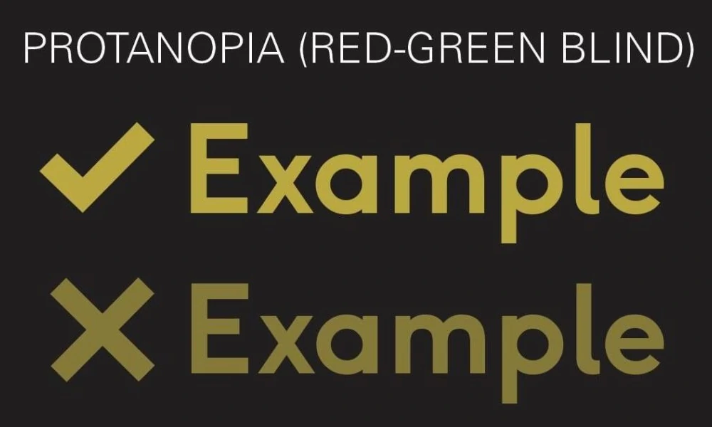
3. Use more than just colour to indicate important information
Try using different patterns, icons, or text labels to coincide with colour changes.
For example, say your website instructed someone to click on the green link. A user with normal vision might be able to differentiate between a red and green option, but someone with colour blindness might have trouble. By adding icons alongside the colour changes, more users will be able to choose the correct option.
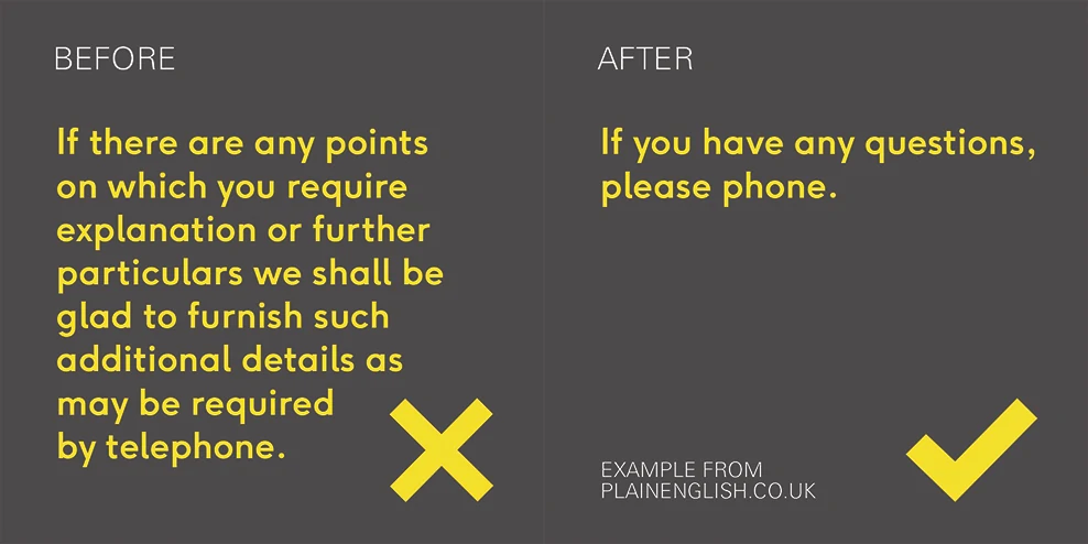
4. Simplify your text
In this digital world of fast scrolling thumbs, 5 second videos, and 280-character memos, it’s easy to see why simplifying your text is important for inclusivity.
You’re (presumably) not writing a novel or college paper with a word count, so avoid the gobbledygook and get to-the-point.
Simplified text looks more personable, more professional, and more readable for those with dyslexia, vision impairments, attention disorders, ESL speakers, and everyone everywhere.
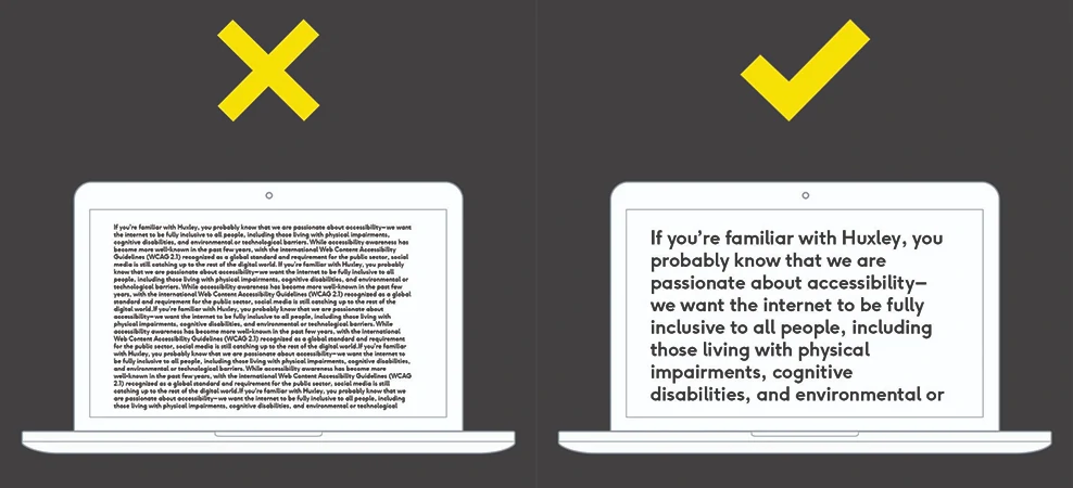
5. Set body text to 18px or larger
Most people don’t read websites and articles word-for-word; they scan and oftentimes abandon the page halfway through. By setting larger body text, you’re increasing the readability and usability, making it easier for your audience to read and comprehend the content. Large blocks of small text can be daunting for most people, but especially those with visual impairments, dyslexia, and other disabilities.
Larger text is also more scalable across different platforms and distances, from tiny mobile screens to massive smart TVs. Your readers should never have to squint to view your content.
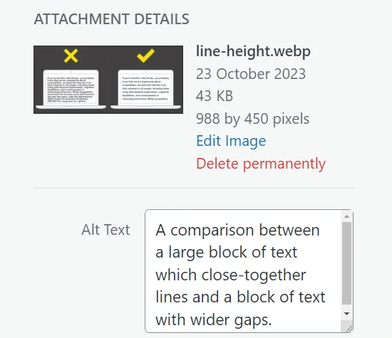
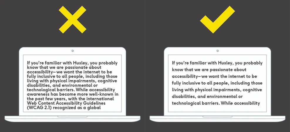
6. Use a line height of at least 1.5
W3C recommends using a line height of at least 1.5 (150%), and it’s easy to see why.
The space between the lines makes it easier to guide the viewer’s eye to the next line, plus it looks cleaner and more professional.
A small adjustment like this can mean a world of difference to your audience, so always make sure you’re designing with accessibility in mind.
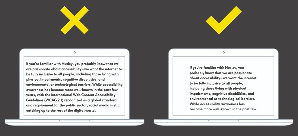
7. Shorten your text line lengths
Specifically, between 50-60 characters on desktop and 30-40 characters on mobile.
We’ve talked about font size and line height, so now it’s time to talk about line length. The last thing you want to do is make your audience have to move their head side to side. The truth is, no one is going to read your copy if it’s going from screen edge to screen edge with no margin. It’s overwhelming and looks bad.
By keeping it between 50-60 characters (or 10-15 words), you’re making it easier for your viewer to skim or scan your information. Of course, this all depends on the font size you use, but as a general rule, it’s better to keep large blocks of text at a short length.
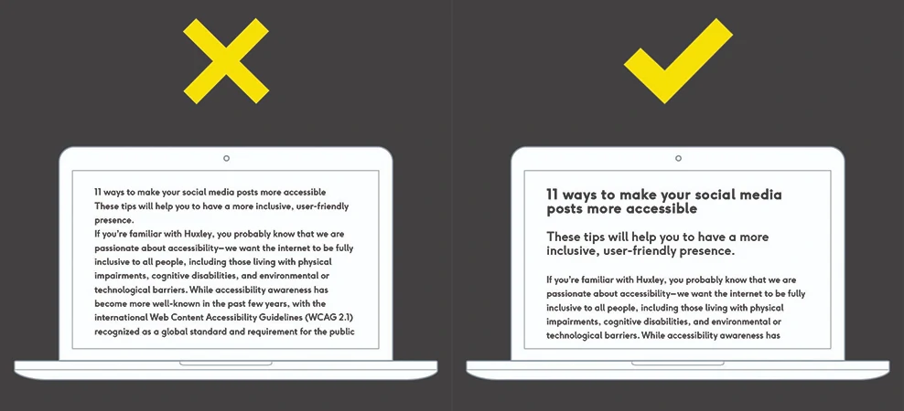
8. Use clear visual hierarchy
By using separate styles for headings, subheadings, and body text, you are making it easier for your audience to find and comprehend text content.
It’s also important to ensure you’re using the correct HTML tag for each section, as screen readers use these to read linearly.
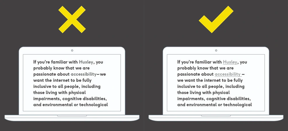
9. Make links look like links
Ensure your link style looks different from the surrounding text. This will make it easier for users with visual impairments, as well as users that are scanning or skimming. If it’s too similar, it likely won’t be clicked on.
You can increase the colour contrast, change the type weight, add an underline, or combine these elements to make the link stand out.
10. Keep button text short
By maintaining clear call-to-actions, you can ensure your website is readable and clutter-free. This is important for those who use screen readers, as well as those who are trying to scan for important information.

11. Optimise keyboard navigation
WebAIMsays it best:
“Keyboard accessibility is one of the most important aspects of web accessibility. Many users with motor disabilities rely on a keyboard. Some people have tremors which don’t allow for fine muscle control. Others have little or no use of their hands, or no hands at all. Users without disabilities may use a keyboard for navigation because of preference or efficiency.”
Ensure focus states are clear and obvious, your interactive elements follow a logical order, and your navigation isn’t too lengthy.

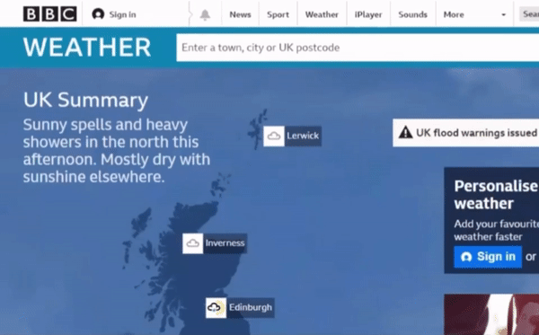
12. Optimise drop-down menus
Drop down menus, or fly-out menus, can be tricky when considering accessibility and responsiveness. While they may work as intended for some mouse users, they can be especially cumbersome for those who rely on keyboard navigation, those who have tremors, or those on mobile devices.
W3C has a helpful tutorial for ensuring drop down accessibility with slightly separate considerations for mouse and keyboard users. Check it out here.
If you can’t make a drop-down menu accessible, it’s best to avoid it altogether. In this example, we looked at the BBC’s website navigation. The drop down menu is accessible and easy to use across different screen sizes and types of interaction.
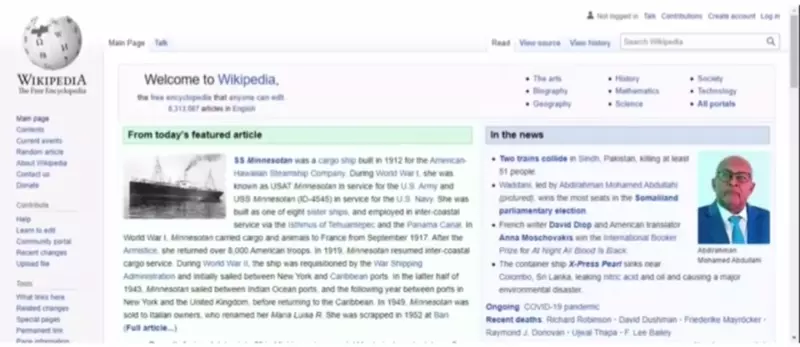
13. Make sure your website is zoomable, scalable and responsive
Some users with vision impairment may rely on the zoom magnification function to access your website’s content. If your website isn’t fully optimised for scalability, text and other components may overlap or clip when zoomed in.
The internet isn’t only accessed from computers anymore. We can now browse our favourite sites on phones, tablets, gaming systems, and even refrigerators. This can make website design tricky, and the one-size-fits-all mindset won’t always apply.
By ensuring your website is fully responsive for all screen sizes, you’re making your website more accessible. This means ensuring all your typography, text elements, images and videos, and touch elements are fluid and will automatically resize accordingly, without compromising on content or design.
In this example, we look at the problematic Wikipedia homepage when zoomed in. The overlapping text makes it difficult to read and select the desired link.
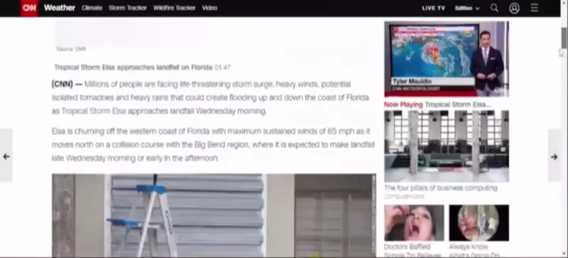
14. Avoid auto playing media
We’ve all tried to read an article in a quiet offie when a loud video starts playing automatically and then the whole office knows about your toenail problem and you can’t close the tab quickly enough.
Besides it being jarring and potentially embarrassing, it can also be incredibly detrimental to the experience of those with access needs, including those who rely on screen readers, those with cognitive impairments, and those with photosensitive epilepsy.
To be more accessible, ensure your embedded videos and audio have clear controls to start, stop, and change the volume. In this example, we look at CNN’s intrusive auto played video while trying to skim an article.
15. Be mindful with animation and flashing content
GIFs and scrolling effects can be distracting and detrimental to the experience of your audience, especially if they suffer from motion sickness or photosensitive epilepsy.
From rapidly flashing animations to highly contrasted geometric patterns to Zoom videos with moving ceiling fans in the background, unintentional triggers are more common than you’d think.
Some tips you can try:
- Ensure no content flashes or flickers more than 3 times per second
- Be careful with videos and animations on autoplay; offer an easy way to stop a video if needed
- Avoid displaying many high-contrast stripes or other geometric patterns together
- Avoid scrolljacking, or manipulating the scroll action to move in an unexpected speed or direction
- Use a clear trigger warning if you do need to display overly animated or flashing content
For an example, check out the Huffington Post article ‘FML’ by Michael Hobbes. They use a combination of flashing lights, animation, contrasting patterns, and scrolljacking to make a unique but distracting display. Luckily, they also posted a text-only version, which is a little difficult to find.

16. Caption all video content
According to Hearing Link, 1 in 6 people in the UK are affected by hearing loss, which can make viewing video content challenging.
Ensuring your videos have accurate and synchronised captions is important to those who suffer from hearing impairments, or even those who are in a quiet setting and don’t want to distract others.
Luckily, social media is catching on to these accessibility requirements – YouTube, Instagram, and TikTok have implemented auto captioning features, so if you don’t have the time to type out all dialogue, you can still ensure your videos are accessible with the click of a button.
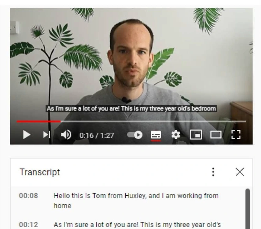
17. Provide transcripts for all multimedia
Screenshot of a Youtube video of Tom talking to the camera with the timestamped transcript underneath.
Screenshot of a Youtube video of Tom talking to the camera with the timestamped transcript underneath.
In the last tip we talked about captions, and now we’re looking at transcripts. Unlike captions that are embedded in the video themselves, transcripts are separate from multimedia and exist in a standalone text format. Transcripts include the spoken word, as well as descriptions of important audio information (like laughter) and visual information (like someone entering the room).
Transcripts are great for a number of reasons: they help deaf/blind users access content with Braille devices, make your audio content accessible for those in a noisy environment or those who don’t have time to listen, and they’re searchable, which is super important for SEO.
If you don’t have time to transcribe yourself, you can always use a transcription or audio-to-text service.Don’t assume your audience will watch or listen to your content – they may not be able to, so always include a transcript.
18. Always include alt text in non-text elements
Probably one of the most well-known aspects of digital accessibility, alt text is an important way to ensure people who use screen readers are able to access your photos and graphics. It’s also important if your image fails to load, and is helpful for SEO.
Make sure your alt text is descriptive without being flowery – it should be succinct and accurate, without adding redundant information (like “Photo of”, “Graphic of”, etc.)
In this example, we look at a stock image used on the Huxley blog, with the alt text being read out by NVDA, a free, open-source screen reader software for Windows.