With Halloween fast approaching and a couple of haunting user-experiences fresh in my mind, I thought it might be worth writing about some of the more gruesome design choices we suffer on the web and maybe suggest a plan for exorcising these.
Inspiration for this post came whilst discussing the re-design and build of a donation portal for our friends at Coppafeel. As part of the design process and my desire to create a simple, easy to use user-experience, I did a lot of research into form design, best-practice and also started to think about the flip-side of this. The more I researched what yields a negative user experience the more I thought about the design and UX choices that either hijack the user journey, or worse, attempt to trick and confuse. Whilst we’re all familiar with these patterns, the thing that began to fascinate me was that these patterns were intentionally designed.
From bad to worse, I identified three broad categories.
Pattern One – Ghosts in the machine
These are patterns that are forced upon us when the tasks we’ve come to a site to perform are interrupted, these two seem eerily common, think of these as irritating if not wholly evil poltergeists.
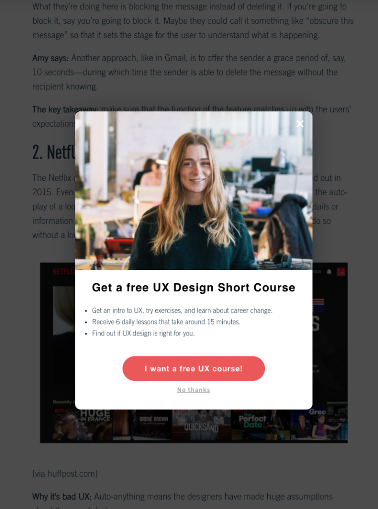
‘Sign up for….’
I’m sure we’ve all experienced this and let out an exasperated sigh every time this happens. We navigate to a page, start to read and having scrolled a few lines down we’re suddenly greeted with a modal encouraging us to sign up for emails, newsletters and all manner of other things we probably don’t want.
With no hint of irony this was found on an article titled ’10 Classic Design Fails That Teach Us How Not To Do UX’
‘We thought you might like’
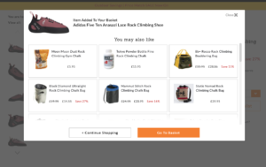
I was driven a little crazy by this whist shopping for a new pair of climbing shoes.
Chuffed to find the shoe I wanted with just over 25% off, I selected my size and added to cart. Clicking ‘Proceed to Checkout’ did just the opposite however and instead brought up a modal suggesting some products I might like. Like some zealous virtual shop-assistant appearing in-front of me asking me if I want to buy some vaguely related products but definitely didn’t.
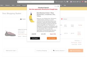
Anyways. Keen to progress I closed the modal using the ‘X’ in the top right hand corner, clicked ‘Go to Checkout’ only to have the modal appear again. After a few irritating fails, I figured out I needed to click ‘Go to Basket’ to escape the loop. On arriving at my basket and keen to pay I clicked ‘Secure Checkout’, a halloween flavoured treat for anyone who could guess what happened next.
Yep.
I wouldn’t describe either of these patterns as being dark – they’re not trying to deliberately deceive me after all, but they feel intrusive and, call me old fashioned, rude. To finish the story about rock shoes, I hung on in and bought them, but these modals and another shocking fail further down the line meant I’ll probably never use this site again – unless to price match and then go somewhere else.
Pattern Two – Bloodthirsty ghouls
Next we’ve the out-right vampires. Moving away from what is essentially poor UX, the next examples involve organisations either making choices for, or deliberately tricking the user whilst masquerading as being helpful – classic dark-patterning.
The term Dark Patterns was first coined by UX designer Harry Brignull back in 2010 to describe “tricks used in websites and apps that make you do things that you didn’t mean to, like buying or signing up for something.” More than poorly thought out or implemented UX, they’re deliberate design choices or patterns that have been “crafted with great attention to detail, and a solid understanding of human psychology, to trick users into doing things they wouldn’t otherwise have done”.
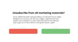
Replacing the expected with the unexpected.
The classic. Primarily used to trick users into signing up for things they don’t want, or rather to stop you from doing what it is you actually want to do. Here colour and the positioning of elements are used to confuse the user. A title may say something along the lines of ‘Opt out of all notifications’ but the colours we’ve grown to associate with stop and go have been swapped. We click the green button thinking ‘Yes I don’t want to receive emails from you and your partners’, alas we’ve just been duped into signing-up.
Hey! How about we get you to pay extra for some things you don’t want?
Next we have an act that Brignull described as ‘the equivalent of a supermarket manager putting items in your shopping trolley without your permission.’ Here, a hosting company uses a mixture of fear, design and unsolicited up-selling to influence and trick the user.
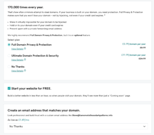
In screen one I’m excited, I can get the url for my website ‘takemetothosedarkpatterns’ for £3.12 and save just under twenty pounds.

In screen two we begin to see the darker patterning emerge. Disguised once again as a helpful sales assistant, and this time one who wants to not only sell us a cheap domain but keep us safe. Our kindly expert informs us that the internet has 170,000 CRIMINALS, all of whom are looking to steal our domain, and have offered to protect us for the reduced amount of £5.99. What’s more they’ve pre-selected the Full Domain Privacy & Protection option to ensure we make the right decision about our domain’s safety. I guess at this point we’re just experiencing a bit of up-selling, but it is nonetheless a little shady choosing and placing products in our basket we might not want and leveraging fear to keep these there. I’d argue too that the ‘no thanks’ at the bottom of the page is positioned deliberately too, suggesting that this is saying no thanks to everything, where in reality it’s only saying no to an email that incorporates the domain name.
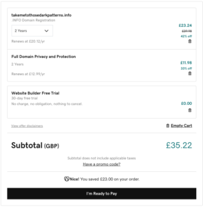
In screen three we come to the checkout and our expected tally of £3.12 has gone up a fair bit, I chose to protect my domain, but the overall price has increased by just over thirty-two pounds. How? Well, if we look at the checkout two years domain registration and protection have been applied (I wanted one, and assumed I was paying for one), if we go back to our initial screen in small print we see the caption advertising the domain says ‘for the first year’. Thanks for that, and you haven’t added tax yet you say?
Only three left and haven’t we met before?
Our final vampiric examples are utterly shameless. You know that consumer item you can’t live without the one our helpful website informs us is one of only three remaining, the one that twelve other people viewed in the last hour? It’s a scam. Ever noticed how flights go up on websites when you return to view again, another scam. Both techniques are designed to pressurise you into buying.
Pattern Three – Here’s Johnny!

Otherwise known as ‘How the hell do I unsubscribe?’, The Shining of dark-patterns.
“An effective dark pattern has to make it very easy for a user to get into a situation and hard to get out of it.”
A well know, somewhat satanic, online superstore’s prime subscription service epitomises this pattern perfectly – it’s incredibly easy to sign up and incredibly difficult to end membership. The choice to end membership is buried several clicks into the process and made deliberately confusing; finding navigation options is hard and titling is rarely explicit. In a test it took me three easy clicks to sign up – thus conforming to the best practice mantra of enabling users to perform whatever task it is they want to within three mouse clicks. It took me over a dozen head-scratching clicks to unsubscribe. The process was so tortuous I decided not to share the dozen or so screen-grabs.
Why is this process so hard? Apart from the obvious answer that said company want your money, they want to make the process of unsubscribing deliberately difficult and even stressful maybe even forcing you to stop and do it some other time. Even if you persevere and make it to the cancellation screens it still takes three clicks to leave and before we can do that we’re told how much we’ll be missed, reminded of all the benefits we might lose, given the opportunity to delay our decision and then finally asked to confirm our choice. All this of-course is if you actually remember to cancel the 28 day free trial membership that you gave up on trying to cancel last month.
Driving a stake through the heart of dark patterns
So how do we change things? Sadly slowly and perhaps never – we can’t stop marketing teams and businesses deciding to add modals where we least want them and we can’t stop organisations making it debilitating to unsubscribe. I guess the most simple and effective way is to vote with our feet, to not use or to stop using whatever the service that treats us with such disdain and tell those concerned why, publicly too – Twitter may for once be a force for good here. Bad design is bad design, but deliberately taking money or data from users by misleading them deserves a little bit of online shaming, doesn’t it?
Useful links
https://www.darkpatterns.org/types-of-dark-pattern
https://www.darkpatterns.org/